From BlackWhite magazine - issue 08, over the rainbow
Christchurch-based designer Tom Norman has a lot to celebrate.
He’s been newly appointed as a Fellow of the Designers Institute of New Zealand (DINZ), he’s recently served as a judge for the Best Awards and he has a host of carefully considered projects in gorgeous Resene colours under his belt – including one that has been recognised with a Resene Total Colour Master Nightingale Award and a Resene Total Colour Heritage Award. Despite his successes, he isn’t one to tout his skills and hard-earned achievements – but those who know him have plenty of positive things to say.

“Since the day he joined the team at Three Sixty Architecture, Tom has brought new life and ideas to our interior design space – lifting our projects to a new level of quality and authenticity,” says Director Dean Cowell of his colleague. “When it comes to colour, Tom is not one to simply follow the latest trend; he always takes the time to understand the space and the people who will use it. He then will interpret and reveal what he has found through colour. Sometimes this will mean light and airy, other times bold and bright, but always perfectly matched to the space.”
DINZ Chief Executive Officer Cathy Veninga says those appointed as Fellows have provided especially meritorious or distinguished service to the Institute or the design profession. “Tom is a talented designer with Best Awards projects associated with his name, yet he has consistently always found time to give back. Over the course of many years, he has been supportive in serving the DINZ design community – locally in his home town of Christchurch, on the DINZ National Board, as a judge for the Best Awards and, currently, as part of the Christchurch DINZ Working Group. He understands the value of connecting our emerging talent to the professional industry and has given his time generously to working with ARA (formerly CPIT) encouraging participation in the Christchurch design community and to enter the Best Awards.”
Tom shares more about his career highlights so far, stand-out projects and favourite Resene colours.

Did you always want to pursue a career in design?
I wanted to be an architect or a graphic designer – I sometimes think I’ve ended up somewhere in the middle. I completed a Bachelor of Design specialising in Spatial Design, but I generally consider myself an interior designer.
You have recently been appointed as a DINZ Fellow and served as a judge for the Best Awards in the Spatial category. What was it like trying to decide between the many different creative projects that were submitted for awards consideration and how does it feel to be recognised as a Fellow?
Judging was surprisingly exhausting – not something I’d expected. Knowing how much effort we all put into our work, and our award entries, it was incredibly hard trying to filter out the best of the work. Being recognised as a Fellow is quite humbling, especially when looking through the list of other Fellows.


Which projects stand out as being highlights of your career so far?
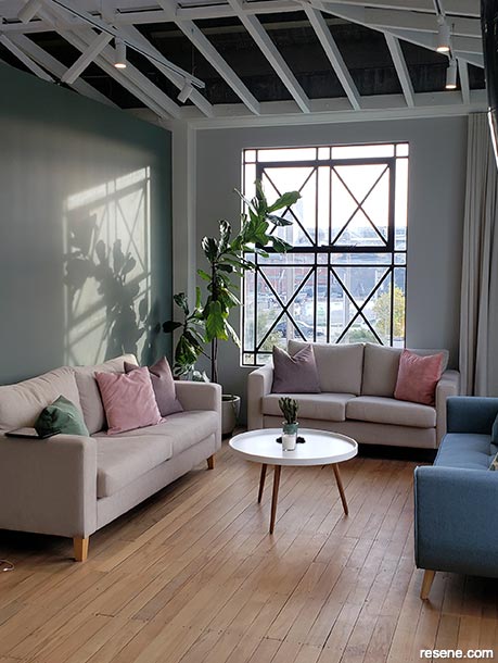
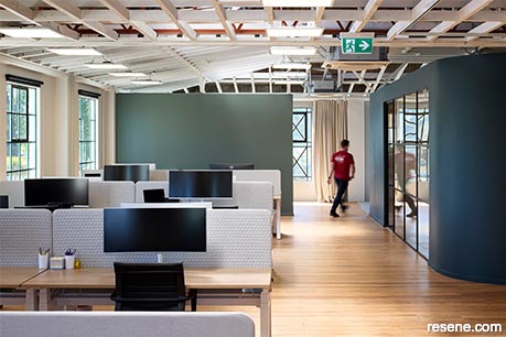
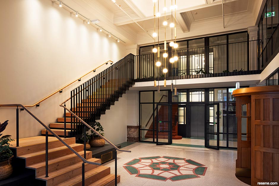
I’ve worked across most typologies and all different scales so it’s hard to pinpoint one particular project. A few highlights from different phases of my career would be the Cookie Time building in Queenstown, the Ara Institute Kahukura building in Christchurch and, more recently, the Public Trust building and Municipal Electrical Department (MED) building restorations in Christchurch.
What was it about those projects that made them stand out for you?
Each project has a different reason for being special. For Cookie Time, we had one of the most imaginative clients I’ve ever dealt with – and that made it a really energetic and creative project to be involved in. Kahukura was designed following principles of the Living Building Challenge and it was a chance to explore new building techniques and really push my passion for sustainable design. It was also where I studied, and one of my old tutors was still teaching, so there was a personal connection as well that was quite special. Both the Public Trust and MED buildings were opportunities to work on cherished historic buildings, which are something we don’t have many of in Christchurch anymore.
How would you describe your approach to using colour in your projects?
I don’t really have a set approach – it really changes for each project. Sometimes, a client’s brand might dictate the use of a colour early in the project whereas, other times, I’ll bring it in to complement the materials we’re working with.
If you could go back in time to the beginning of your career, what advice would you give a younger version of yourself?
I think something that’s really important as a design professional is to learn how to separate your own personal tastes from what you create for a client. You need to understand what is being asked in the brief and answer that to suit the client’s needs, not your own favourite shape, colour, fabric or material at the time. But at the same time, the reason they’ve come to you is for your expertise, so always look for ways to give them more than what they ask for and develop their brief with them.
Do you have any top tips or advice to share about specifying paint, stains or coatings?
Have a good relationship with your Resene rep! I pretty much speak to mine several times a month to check on correct specification details.
What do you love about Resene?
I’m terrible at remembering which type of paint to use where, so what I really like about Resene is that I can call my rep with a very, very vague idea of what I want to do and he’ll help me with the specification. I also really like being able to get custom colours and have them stored for future use.
What is your favourite Resene product and why do you keep coming back to it?
Paint. I use it because I know it’s not going to give me any problems in future, I’m not going to have painters complaining to me on site, and if, in the very rare instance something does go wrong, my Resene representative will help to sort it out.
What are your current favourite Resene colours, what do you like about them, and how would you envisage using them on a project?
Resene Pink Panther or Resene Hopskotch. I would love to use them on a project but have never found the right one. Resene Wan White is my current favourite white. It is a nice non-descript base for other finishes to layer on top of. Also, Resene ‘Avenues White’ – a custom colour that I used in my own house which sits well against the type of lighter timbers that I like to use.
› To see more of Tom’s design work as an Associate at Three Sixty Architecture, visit www.threesixtyarch.co.nz.
Colours mentioned in this article...
Products mentioned in this article...
This is a magazine created for the industry, by the industry and with the industry – and a publication like this is only possible because of New Zealand and Australia's remarkably talented and loyal Resene specifiers and users.
If you have a project finished in Resene paints, wood stains or coatings, whether it is strikingly colourful, beautifully tonal, a haven of natural stained and clear finishes, wonderfully unique or anything in between, we'd love to see it and have the opportunity to showcase it. Submit your projects online or email editor@blackwhitemag.com. You're welcome to share as many projects as you would like, whenever it suits. We look forward to seeing what you've been busy creating.
Earn CPD reading this magazine – If you're a specifier, earn ADNZ or NZRAB CPD points by reading BlackWhite magazine. Once you've read an issue request your CPD points via the CPD portal for ADNZ (for NZ architectural designers) or NZRAB (for NZ architects).
![]() Get inspired ! Subscribe
Get inspired ! Subscribe ![]() Get saving ! Apply for a DIY card
Get saving ! Apply for a DIY card
![]()
Can't find what you're looking for? Ask us!
Company profile | Terms | Privacy policy | Quality and environmental policy | Health and safety policy
Colours shown on this website are a representation only. Please refer to the actual paint or product sample. Resene colour charts, testpots and samples are available for ordering online. See measurements/conversions for more details on how electronic colour values are achieved.
What's new | Specifiers | Painters | DIYers | Artists | Kids | Sitemap | Home | TOP ⇧