From BlackWhite magazine - issue 08, neutral ground
Don’t overlook these neutral hidden gems when choosing Resene paint colours for your upcoming projects.
If you were to ask a handful of architects, interior designers or builders to name their favourite Resene paint colour, the odds are overwhelmingly good that hues like Resene Rice Cake, Resene Merino and Resene White Pointer would come up – and you can be all but certain that Resene Black White and Resene Alabaster would be mentioned by multiple interviewees. These all-time favourites grace the Resene Top 20 colours year upon year and they can all be easily found at the front of the Resene The Range Whites & Neutrals fandeck.

There are, however, plenty of circumstances that can arise where the go-to Resene neutrals you’ve come to rely on aren’t the right fit for the job at hand. Maybe they don’t sit right with your client’s chosen accent hues or the natural lighting circumstances within the space or perhaps you just need a neutral that offers a little extra ‘oomph’. In these instances, the Resene Whites & Neutrals collection is often the first port-of-call. After all, this colour chart contains hundreds of beautiful neutral alternatives. But for those who are after something really special, you’d be remiss to pass up on the many gorgeous neutrals you’ll find peppered throughout another popular colour chart: the Resene Multi-finish collection.
The neutrals you’ll discover within this expansive collection are often overlooked by many in their hunt for the perfect paint colour because, at first glance, the Resene Multi-finish collection appears to be anything but neutral. But upon closer inspection, you’ll find hundreds of white, cream, beige, greige, taupe, brown, grey and black options that have plenty to offer your colour palette as the majority of these neutral colour options have the kind of complex undertones to warrant categorising them as character neutrals.
Character neutrals have become more widely recognised and understood in recent years. The term refers to muted and understated colours that are infused with subtle undertones. Many times, these hues are ‘chameleons’ in that they have the tendency to take on a strikingly different appearance depending on the light conditions they are exposed to and the other hues they’ve been paired with.
top tip The Resene The Range Whites & Neutrals collection includes hundreds of classic choices that span from whites and off-whites through to blacks and off-blacks. But if you or your client feel overwhelmed with options, start by perusing the latest Resene The Range fashion colours collection – where you’ll find a curated selection of today’s top trending neutrals – and build out your palette from there.
Another benefit of looking to the Resene Multi-finish collection to select your neutrals is that, when you do want to introduce more chromatic hues to your colour palette, you’ll find over a dozen different suitable options right on the same colour card – helping take the guesswork out of finding perfect pairings when more variety or contrast is needed.
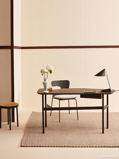
In this office, the creative addition of trim in Resene Brown Pod brings contrast, depth and a more ‘human scale’ to the space while also echoing the darker tones of the furniture and accessories. Walls painted in Resene Anglaise, architraves in Resene Brown Pod and floor in Resene Half Sour Dough. Desk, chair and rug from Ligne Roset, stool and lamp from Good Form, vase, book and notepad from Tessuti.

Practicality is often cited as a driving factor behind the popularity of neutrals, which are considered less likely to go out of style – thus ensuring that spaces retain a classic appearance over time. However, they are not immune to trend cycles. Today, warmer neutrals like cream, beige, greige and brown have overtaken cooler, flatter greys and whites as the preferred choice for clients looking for a fresh and contemporary yet inviting vibe.
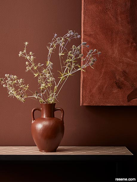
Back wall painted in Resene Anglaise, desk tray in Resene Brown Pod, pen holder in Resene Pendragon and small vase in Resene Alamo. Desk and chair from Ligne Roset, vase, notepad and pencil from Tessuti.
In interior design, character neutrals offer a calming and sophisticated atmosphere. These tones create a sense of cohesion, tying together disparate elements in a space. They act as a unifying force, allowing diverse furnishings, artwork and accessories to coexist harmoniously. Neutrals like Resene Westar, Resene Dover White, Resene Swiss Coffee, Resene Greywacke and Resene Mystic provide a blank canvas for occupants to personalise their living or working environment with pops of colour or unique decor items without appearing flat or dull.
On exteriors, more pigmented character neutrals from the Resene Multi-finish collection are superbly effective. If you’re trying to make your project standout within a sea of white weatherboards without shouting or clashing with the building’s natural surroundings, muted earth tones are easy-to-fall-in-love-with alternatives. Colours like Resene Gumboot, Resene Soya Bean and Resene Cobblestone can be particularly suitable for exterior use because they don’t appear as ‘washed out’ when viewed under direct daylight conditions the way subtler colours can be. But always remember, when using or specifying a darker colour outdoors, ask for it to be tinted into a Resene CoolColour formula. Resene CoolColours look like normal Resene colours but have special pigment technology that reflects more heat, so they don’t get as hot as normal colours would. Resene CoolColours are created by replacing the standard carbon black pigment that absorbs heat and light with a unique pigment that enables more of the infrared portion of the sun’s energy to be reflected. While the sun’s visible and ultraviolet light will still reach the exterior surface, the coating and substrate beneath will be better protected than it would be with the normal colour.
To demonstrate just how versatile neutral options from the Resene Multi-finish collection can be, check out these three projects which all rely on the same palette. Simply by employing Resene Half Sour Dough, Resene Alamo, Resene Pendragon, Resene Anglaise, Resene Toffee and Resene Brown Pod across different surfaces in modified ratios, you’ll find you can achieve strikingly different results. Their subtle undertones bring far more interest and nuance than purer neutrals while maintaining the flexibility that neutrals are prized for.
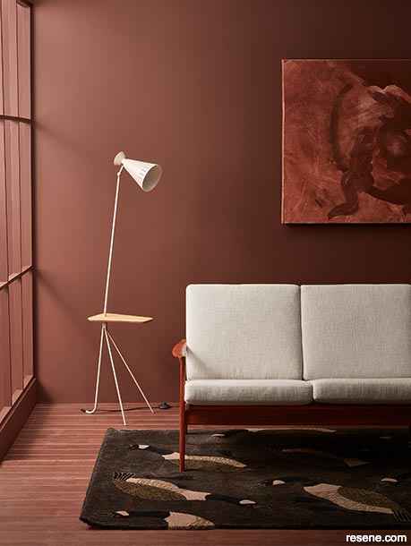
By simply changing up the ratios that each of your paint colours are used within your scheme, you can create a dramatically different effect. Whether you are working on a residential home, commercial space or public building, Resene Half Sour Dough, Resene Alamo, Resene Pendragon, Resene Anglaise, Resene Toffee and Resene Brown Pod can be remixed to suit a variety of different design styles and tastes.
Timber background stained in Resene Colorwood Bark with A4 drawdown.
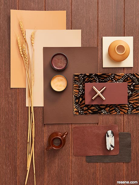
Paint swatches in (from bottom) Resene Pendragon, Resene Alamo and Resene Brown Pod, testpots in (from left) Resene Brown Pod and Resene Alamo and small vases painted in Resene Alamo (top left) and Resene Brown Pod (bottom right). Materials (clockwise from top left): tile from Tile Space, fabric from Hodsoll McKenzie, pressed panel from FENIX, hardware from Archant, leather from Vera Relle, handle from Arc Department.
Background painted in Resene Pendragon with A4 drawdown.
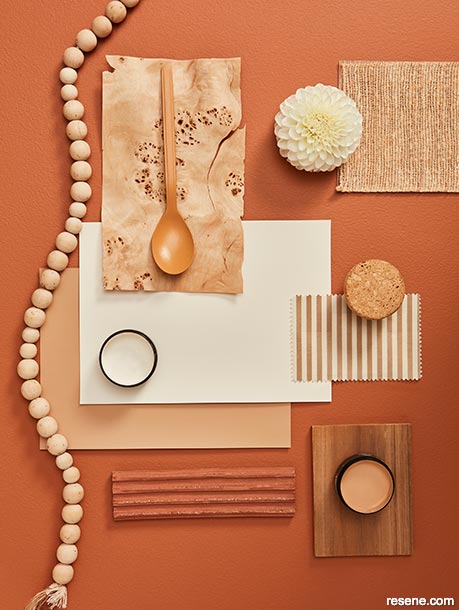
Paint swatches (from bottom) in Resene Alamo and Resene Half Sour Dough, testpots in (from left to right) Resene Alamo and Resene Half Sour Dough and spoon painted in Resene Alamo. Materials (clockwise from top left): fabric from James Dunlop Textiles, fabric from Mokum, tile from Tile Depot, walnut sample from Rosenfeld Kidson, fabric from Mokum, cork knob from Archant.
Background painted in Resene Half Sour Dough with A4 drawdown.
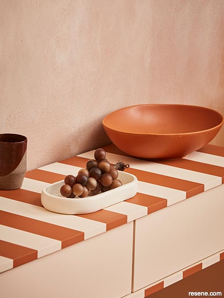
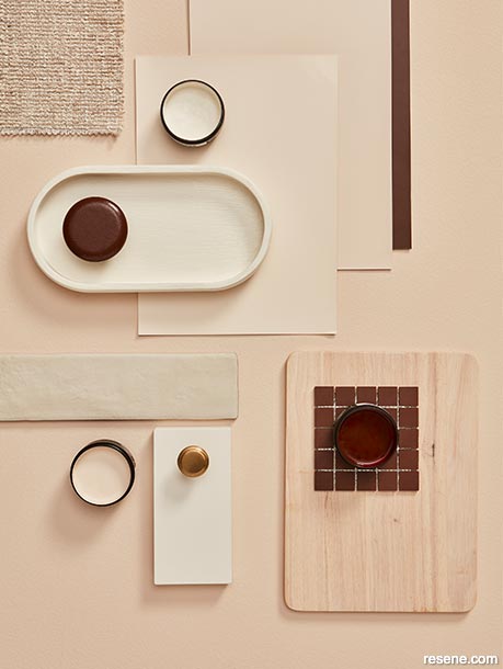
Paint swatches in (from bottom) Resene Anglaise, Resene Half Sour Dough and Resene Brown Pod, testpots in (clockwise from top) Resene Brown Pod, Resene Half Sour Dough and Resene Half Scotch Mist, oval dish in Resene Half Scotch Mist, round wall hook in Resene Brown Pod and wooden board finished in Resene Colorwood Whitewash. Materials (clockwise from top right): square tiles from Tile Space, pressed panel from FENIX, knob from Archant, long tile from Tile Space, fabric from Zinc Textile. Projects by Amber Armitage, images by Wendy Fenwick.
› Have you used neutrals from the Resene Multifinish collection in a recently completed project? Your work could help inspire others in the industry. Send images to editor@blackwhitemag.com and share some details about your design for a chance to be featured in our newsletter or in an upcoming issue of the magazine.
Colours mentioned in this article...
Products mentioned in this article...
This is a magazine created for the industry, by the industry and with the industry – and a publication like this is only possible because of New Zealand and Australia's remarkably talented and loyal Resene specifiers and users.
If you have a project finished in Resene paints, wood stains or coatings, whether it is strikingly colourful, beautifully tonal, a haven of natural stained and clear finishes, wonderfully unique or anything in between, we'd love to see it and have the opportunity to showcase it. Submit your projects online or email editor@blackwhitemag.com. You're welcome to share as many projects as you would like, whenever it suits. We look forward to seeing what you've been busy creating.
Earn CPD reading this magazine – If you're a specifier, earn ADNZ or NZRAB CPD points by reading BlackWhite magazine. Once you've read an issue request your CPD points via the CPD portal for ADNZ (for NZ architectural designers) or NZRAB (for NZ architects).
![]() Get inspired ! Subscribe
Get inspired ! Subscribe ![]() Get saving ! Apply for a DIY card
Get saving ! Apply for a DIY card
![]()
Can't find what you're looking for? Ask us!
Company profile | Terms | Privacy policy | Quality and environmental policy | Health and safety policy
Colours shown on this website are a representation only. Please refer to the actual paint or product sample. Resene colour charts, testpots and samples are available for ordering online. See measurements/conversions for more details on how electronic colour values are achieved.
What's new | Specifiers | Painters | DIYers | Artists | Kids | Sitemap | Home | TOP ⇧